DHA (Dubai Health Authority) app case study - 2022
Optimizing the User Experience of COVID-19 Services Offered by the DHA to Improve Efficiency and User Satisfaction
Role
UX/UI Designer
Industry
Healthcare
Tools
Figma, Notion, Miro
Duration
1 month
Project type
Healthcare Application
Taget Audience
Dubai Residents

Choosing the DHA App: The Why
DHA app proved to be a valuable tool during the pandemic, providing easy access to COVID-19 related services. As a healthcare enthusiast, I found myself frequently using the app and began to explore its functionalities. This experience led me to choose the DHA app for my case study. The aim of this case study is not to undermine the efforts taken by the DHA and my observations are limited as a designer I don't have access to data.
Introduction to the DHA App
It is a unified smart application by the Dubai Academic Healthcare Corporation, enabling residents to access and manage various health services in one platform.
Setting Primary Objectives for this Case Study
Examine Usability and User Interaction: Utilize heuristic analysis, primary, and secondary research to identify usability issues in the DHA app, particularly for COVID-19 services, and illustrate these challenges through user journey maps.
Develop and Refine Solutions: Analyze insights to create user flows, design potential improvements, and validate these solutions through user testing to enhance overall user experience.
Design Process

Project Breakdown

Insights from the research
Secondary research: I explored common themes in user reviews and conducted a brief heuristic evaluation to identify specific usability issues.
MRN Management: Challenges with setting up and managing MRN connections, sometimes requiring additional support.
Service Accessibility: Some processes, like appointment booking, may still require phone interaction for completion.
Doctor Availability: Users need to individually check each doctor’s availability, which could be streamlined.
Vaccine Information: Limited details on international vaccines and guidance for subsequent doses in the UAE.
Clearance Certificates: Guidance on obtaining clearance certificates can be enhanced, particularly for tests conducted outside DHA facilities.
Chat Service Reliability: Occasional interruptions in the chat service, which is not integrated within the app.
Interface Usability: Opportunities to improve the app's interface for better user experience and readability.
Primary research: I conducted a field study involving five users, assigning them tasks related to the application to observe their interactions. This study was aligned with my initial hypotheses.
Users over the age of 50 experienced anxiety about selecting incorrect services due to the app's governmental nature, and they struggled with closing pop-up windows and navigating between tabs.
Some users overlooked the bottom navigation bar because it was less visible and the icons were too small.
It was time-consuming for users to learn how to contact DHA or access the chat service.
Locating the feature for obtaining the Clearance certificate was notably time-consuming.
Readability was an issue; better colour contrast could enhance visibility.
Icons for the most frequently used services could be enlarged for easier access.
Bummer: Reality Check on User Assumptions
Based on the reviews and conversations with users, I came to the realization that most of my initial presumptions were incorrect. Despite some users facing difficulties scheduling vaccine appointments, the majority of the feedback I received was positive. This put me in a dilemma on how to proceed, and so I turned to UX formulas and heuristic evaluation to identify areas that needed improvement.
New expats in Dubai may not be familiar with the current vaccination requirements, which can lead to customer service issues and impatience. For example, expats who have received a different vaccination in their home country may not know which additional vaccine or booster is required in Dubai. This information is not available in the DHA app, so expats must either call the DHA or wait in a chat room for a live person to answer their questions.
Discoveries from Research: Analyzing the insights and findings
I used the card sorting framework to systematically categorize the insights gathered from both primary and secondary research.

Following that, I crafted user stories for each category using the "Jobs to be Done" framework.
Key areas of improvement defined using Impact/Effort matrix

Hypothesis 1:
In the current state of the DHA app, users have to manually choose each centre and determine each one's closeness to their site because there is no way to see the closest location. This lack of guidance and information may lead users to call the hotline. Additionally, the feature does not allow users to enter the desired dose or two, nor does it inform them about eligibility. This creates further frustration and inconvenience for users. To improve the user experience, the flow of this feature needs to be made more readable and accessible.
Hypothesis 2:
Getting the clearance certificate is an important feature, and often people are unaware of how many days it takes to get one. The Covid-19 DXB app does this, but since it was also included in the DHA app, people anticipated the certificate to show up here. Once more, this frustrated users because they had to call customer service to request one or to find out more.
BOOKING COVID VACCINATION APPOINTMENT
GETTING A COVID ISOLATION CERTIFICATE
Mapping the User Journey: Identifying Pain Points and Opportunities for Enhanced User Experience


Crafting User Flows: Developing Flowcharts Based on User Journey Insights
Booking Covid Vaccination Appointment

Getting Covid Isolation Clearance Certificate

Getting to the Solutions
🗓 BOOKING COVID VACCINATION APPOINTMENT
Two potential issues were identified while analysing the user flow for booking a Covid vaccination appointment. Solutions were developed to address each of them.
(The user stories were crafted by drawing on insights gathered from the research. These stories have been narrowed down to address the identified areas for improvement specifically)
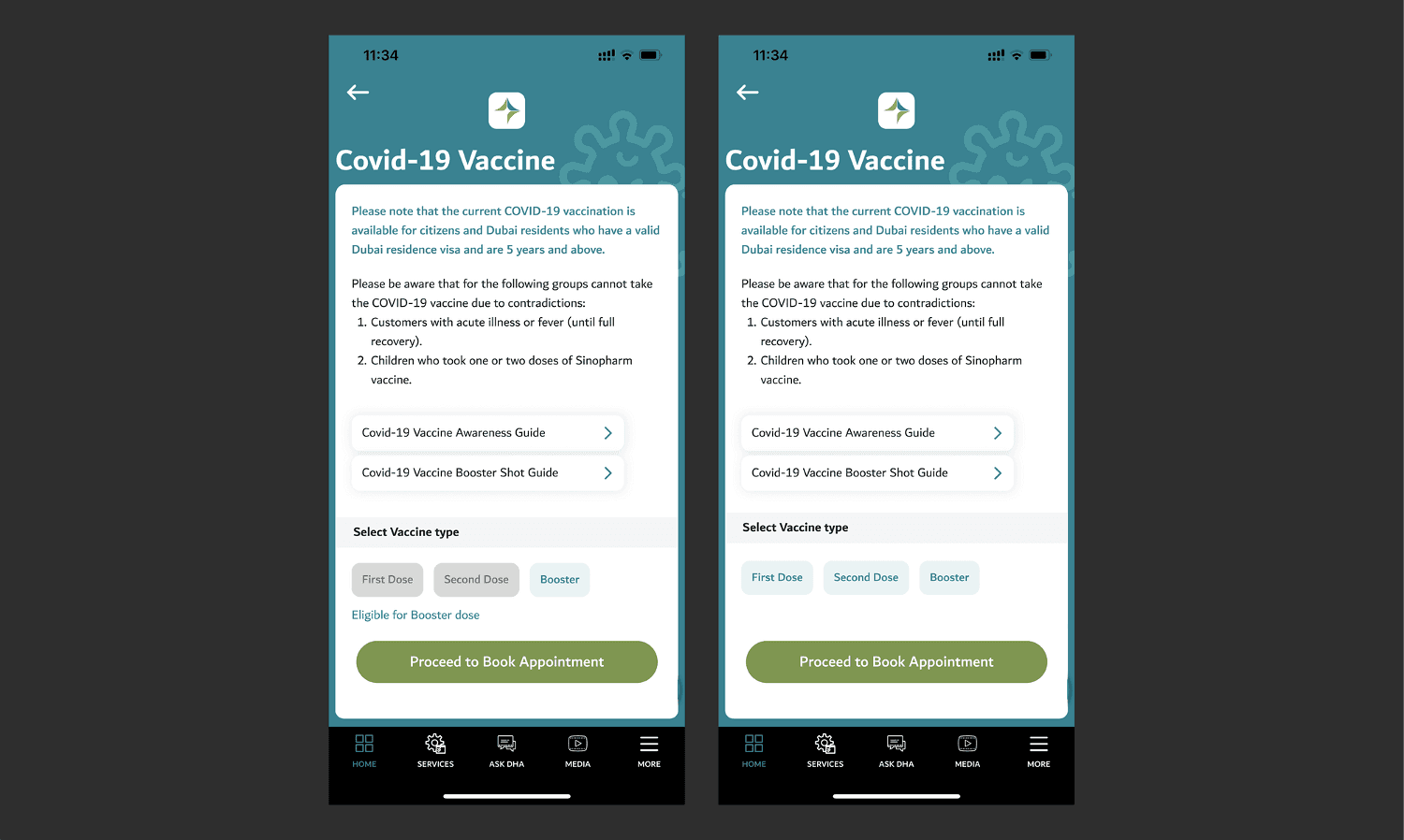
1. Covid Vaccination Appointment Booking - Landing screen

Before
Currently, there is no way to notify users or centres of the next required dose of vaccine. This can lead to confusion, as users and centres may not have this information readily available. As a result, centres may have to ask users about their vaccination history and then direct them to the appropriate queue.
Recommended Approach
User Story: As a resident, I want to book a vaccine appointment so that I can receive the anticipated booster dose.
➡️ Instance A has added the capability to extract previous vaccination records from the MRN number. This can greatly enhance the experience and take the guessing out of it. It can indicate which vaccinations have previously been administered, how many doses are left, and whether the person is eligible for them (by showing the number of months or days till the next dosage).
User Story: As a new expat, I want to know which booster vaccine to take in my current country, given that I have already received the Moderna vaccine in my home country so that I can complete my vaccination schedule and be stress-free.
➡️ Instance B depicts a situation where various vaccination awareness guides are used. This clears up the uncertainty and enables newly arrived expats to make an informed choice. They are further assisted in choosing the optimal dose, for example, first, second, or booster. Additionally, this aids the medical facility's ability to make the appropriate accommodations.
2. Covid Vaccination Appointment Booking - From selecting a centre to reviewing your booking summary

Recommended Approach
The above screens were modified visually to improve the process's flow. Let's examine those improvements:
➡️ Select Location:
To differentiate the Book Appointment button from the Direction button, it was coloured in DHA blue. Introducing a nearby filter will prompt users to share their location, offering information on the nearest centre based on their current site.
➡️ Select Date & Time:
Light-colored bars separated the Morning, Afternoon, and Evening sections for clearer distinction. Spacing is added between the times to enhance touch accuracy for selection. In an earlier version, the absence of day designations led to users having to open the calendar to double-check. As a response, day labels to the dates resolve this issue.
➡️ Confirm booking:
In the earlier version, the content lacked systematic organization, requiring users to scroll to access Date and Time information. Changing this through a structured hierarchy effectively resolved the issue.
➡️ Booking Successful:
The centre-aligned text was converted to left-aligned text for easier reading. The addition of the vaccination type provides the user with information about the dose and name of the vaccine.

📝 GETTING COVID ISOLATION CLEARANCE CERTIFICATE

Before
Accessing the isolation certificate from the home screen involved two unnecessary steps, which can be frustrating, especially considering its importance as a mandatory document for returning to work post-symptom subsidence. Moreover, encountering a message stating "no lab results available" upon clicking, without guidance on obtaining the certificate via the app or other means, may prompt users to seek assistance via the hotline.
Recommended Approach
User Story: As a COVID-19 patient, I want to get my clearance certificate once the isolation is over so that I can resume working
Organizing the COVID services page makes it easy to locate the Isolation Clearance Certificate. Upon clicking, three instances have been identified as outlined below:
➡️ Instance 1: Empty state
In the current design, when the certificate is unavailable, the screen displays a message saying "no lab results." However, in the revised design, users are informed about the purpose of the certificate and guided through the process of obtaining it. This eliminates the need for users to call customer service or any sort of confusion.
➡️ Instance 2: The period of isolation has started but is not yet complete
This lets the user know how long the isolation will last, how many days have already gone, and when it will end. To allow users to understand that the PDF is not yet accessible, the download button has been disabled.
➡️ Instance 3: Completed isolation
The full circle is presented, indicating the completion of the 10-day isolation period. The download button is now active to get the Isolation Clearance certificate.

Impact on Users: Measuring the Positive Impact on Users Post-Enhancement
User performance was evaluated and revised in response to feedback. Tasks for Book Covid Vaccination Appointment and Getting Covid Isolation Clearance Certificate were given to three participants.
🎯 The basic measurements I used to define the quality metrics were as follows:
Success rate (If users could complete the assignment at all?) Yes
Time required to finish the task (compared to the previous one) Comparatively less time was taken by 20%
The error rate (Had the user encountered any issues that prevented them from progressing?) No, the user was able to get through without any issues
User satisfaction (How pleased were they with the revised design, if at all)? Yes, the feedback received was good. And the user seemed satisfied.
Impact on the organization: Potential Outcomes
🏛 Implementing these solutions would have the following impacts:
Decrease response time to resident inquiries
Minimize helpline calls by empowering the app to address common issues, leading to a reduction in call volume
Enhance productivity and efficiency within the current system
Optimize the personalization capabilities of the MRN
Access to easily understandable and actionable information, leading to long-term cost savings
Trust in the organization would grow, fostering increased data accessibility as users rely on a single app for all their healthcare needs
Key Takeaways: What I Learned
Governmental organizations play a vital role in our lives by providing essential data and services.
Addressing the needs of a diverse population is challenging.
During usability testing, I learned that users were able to overcome challenges and complete their tasks, dispelling my initial assumption that they would struggle with the app. This experience highlighted the importance of avoiding personal bias and using UX frameworks and tools for continuous improvement.
Observing how two people view the same component differently was intriguing, which doesn't always align with expectations. Designers must consider barriers such as limited tech literacy, users with disabilities, and other issues.
I overlooked the fact that the services above are also offered on WhatsApp. I'll investigate how this was implemented and which channel residents prefer in the future.
Future Scope
Expand User Testing: Broaden testing with diverse demographics for more comprehensive insights.
Cross-Platform Usability: Ensure consistent user experience across different devices and operating systems.
Address Additional Pain Points: Tackle other identified issues not covered due to time constraints in this initial study.
Iterative Design and Testing: Continuously refine the app based on iterative user feedback.
Improve Interface Design: Focus on enhancing the app’s interface and information hierarchy to boost overall usability and efficiency.

Other projects


DHA (Dubai Health Authority) app case study - 2022
Optimizing the User Experience of COVID-19 Services Offered by the DHA to Improve Efficiency and User Satisfaction
Role
UX/UI Designer
Industry
Health & Fitness
Tools
Figma, Notion, Miro
Duration
3 months
Project type
Healthcare Application
Taget Audience
Dubai Residents

Choosing the DHA App: The Why
DHA app proved to be a valuable tool during the pandemic, providing easy access to COVID-19 related services. As a healthcare enthusiast, I found myself frequently using the app and began to explore its functionalities. This experience led me to choose the DHA app for my case study. The aim of this case study is not to undermine the efforts taken by the DHA and my observations are limited as a designer I don't have access to data.
Introduction to the DHA App
It is a unified smart application by the Dubai Academic Healthcare Corporation, enabling residents to access and manage various health services in one platform.
Setting Primary Objectives for this Case Study
Examine Usability and User Interaction: Utilize heuristic analysis, primary, and secondary research to identify usability issues in the DHA app, particularly for COVID-19 services, and illustrate these challenges through user journey maps.
Develop and Refine Solutions: Analyze insights to create user flows, design potential improvements, and validate these solutions through user testing to enhance overall user experience.
Design Process
Project Breakdown
Insights from the research
Secondary research: I explored common themes in user reviews and conducted a brief heuristic evaluation to identify specific usability issues.
MRN Management: Challenges with setting up and managing MRN connections, sometimes requiring additional support.
Service Accessibility: Some processes, like appointment booking, may still require phone interaction for completion.
Doctor Availability: Users need to individually check each doctor’s availability, which could be streamlined.
Vaccine Information: Limited details on international vaccines and guidance for subsequent doses in the UAE.
Clearance Certificates: Guidance on obtaining clearance certificates can be enhanced, particularly for tests conducted outside DHA facilities.
Chat Service Reliability: Occasional interruptions in the chat service, which is not integrated within the app.
Interface Usability: Opportunities to improve the app's interface for better user experience and readability.
Primary research: I conducted a field study involving five users, assigning them tasks related to the application to observe their interactions. This study was aligned with my initial hypotheses.
Users over the age of 50 experienced anxiety about selecting incorrect services due to the app's governmental nature, and they struggled with closing pop-up windows and navigating between tabs.
Some users overlooked the bottom navigation bar because it was less visible and the icons were too small.
It was time-consuming for users to learn how to contact DHA or access the chat service.
Locating the feature for obtaining the Clearance certificate was notably time-consuming.
Readability was an issue; better colour contrast could enhance visibility.
Icons for the most frequently used services could be enlarged for easier access.
Bummer: Reality Check on User Assumptions
Based on the reviews and conversations with users, I came to the realization that most of my initial presumptions were incorrect. Despite some users facing difficulties scheduling vaccine appointments, the majority of the feedback I received was positive. This put me in a dilemma on how to proceed, and so I turned to UX formulas and heuristic evaluation to identify areas that needed improvement.
New expats in Dubai may not be familiar with the current vaccination requirements, which can lead to customer service issues and impatience. For example, expats who have received a different vaccination in their home country may not know which additional vaccine or booster is required in Dubai. This information is not available in the DHA app, so expats must either call the DHA or wait in a chat room for a live person to answer their questions.
Discoveries from Research: Analyzing the insights and findings
I used the card sorting framework to systematically categorize the insights gathered from both primary and secondary research.

Following that, I crafted user stories for each category using the "Jobs to be Done" framework.
Key areas of improvement defined using Impact/Effort matrix

Hypothesis 1:
In the current state of the DHA app, users have to manually choose each centre and determine each one's closeness to their site because there is no way to see the closest location. This lack of guidance and information may lead users to call the hotline. Additionally, the feature does not allow users to enter the desired dose or two, nor does it inform them about eligibility. This creates further frustration and inconvenience for users. To improve the user experience, the flow of this feature needs to be made more readable and accessible.
Hypothesis 2:
Getting the clearance certificate is an important feature, and often people are unaware of how many days it takes to get one. The Covid-19 DXB app does this, but since it was also included in the DHA app, people anticipated the certificate to show up here. Once more, this frustrated users because they had to call customer service to request one or to find out more.
BOOKING COVID VACCINATION APPOINTMENT
GETTING A COVID ISOLATION CERTIFICATE
Mapping the User Journey: Identifying Pain Points and Opportunities for Enhanced User Experience


Crafting User Flows: Developing Flowcharts Based on User Journey Insights
Booking Covid Vaccination Appointment

Getting Covid Isolation Clearance Certificate

Getting to the Solutions
BOOKING COVID VACCINATION
APPOINTMENT 🗓
Two potential issues were identified while analysing the user flow for booking a Covid vaccination appointment. Solutions were developed to address each of them.
(The user stories were crafted by drawing on insights gathered from the research. These stories have been narrowed down to address the identified areas for improvement specifically)
2. Covid Vaccination Appointment Booking - From selecting a centre to reviewing your booking summary

Recommended Approach
The above screens were modified visually to improve the process's flow. Let's examine those improvements:
➡️ Select Location:
To differentiate the Book Appointment button from the Direction button, it was coloured in DHA blue. Introducing a nearby filter will prompt users to share their location, offering information on the nearest centre based on their current site.
➡️ Select Date & Time:
Light-colored bars separated the Morning, Afternoon, and Evening sections for clearer distinction. Spacing is added between the times to enhance touch accuracy for selection. In an earlier version, the absence of day designations led to users having to open the calendar to double-check. As a response, day labels to the dates resolve this issue.
➡️ Confirm booking:
In the earlier version, the content lacked systematic organization, requiring users to scroll to access Date and Time information. Changing this through a structured hierarchy effectively resolved the issue.
➡️ Booking Successful:
The centre-aligned text was converted to left-aligned text for easier reading. The addition of the vaccination type provides the user with information about the dose and name of the vaccine.

1. Covid Vaccination Appointment Booking - Landing screen

Before
Currently, there is no way to notify users or centres of the next required dose of vaccine. This can lead to confusion, as users and centres may not have this information readily available. As a result, centres may have to ask users about their vaccination history and then direct them to the appropriate queue.
Recommended Approach
User Story: As a resident, I want to book a vaccine appointment so that I can receive the anticipated booster dose.
➡️ Instance A has added the capability to extract previous vaccination records from the MRN number. This can greatly enhance the experience and take the guessing out of it. It can indicate which vaccinations have previously been administered, how many doses are left, and whether the person is eligible for them (by showing the number of months or days till the next dosage).
User Story: As a new expat, I want to know which booster vaccine to take in my current country, given that I have already received the Moderna vaccine in my home country so that I can complete my vaccination schedule and be stress-free.
➡️ Instance B depicts a situation where various vaccination awareness guides are used. This clears up the uncertainty and enables newly arrived expats to make an informed choice. They are further assisted in choosing the optimal dose, for example, first, second, or booster. Additionally, this aids the medical facility's ability to make the appropriate accommodations.
GETTING COVID ISOLATION CLEARANCE CERTIFICATE 📝

Before
Accessing the isolation certificate from the home screen involved two unnecessary steps, which can be frustrating, especially considering its importance as a mandatory document for returning to work post-symptom subsidence. Moreover, encountering a message stating "no lab results available" upon clicking, without guidance on obtaining the certificate via the app or other means, may prompt users to seek assistance via the hotline.
Recommended Approach
User Story: As a COVID-19 patient, I want to get my clearance certificate once the isolation is over so that I can resume working
Organizing the COVID services page makes it easy to locate the Isolation Clearance Certificate. Upon clicking, three instances have been identified as outlined below:
➡️ Instance 1: Empty state
In the current design, when the certificate is unavailable, the screen displays a message saying "no lab results." However, in the revised design, users are informed about the purpose of the certificate and guided through the process of obtaining it. This eliminates the need for users to call customer service or any sort of confusion.
➡️ Instance 2: The period of isolation has started but is not yet complete
This lets the user know how long the isolation will last, how many days have already gone, and when it will end. To allow users to understand that the PDF is not yet accessible, the download button has been disabled.
➡️ Instance 3: Completed isolation
The full circle is presented, indicating the completion of the 10-day isolation period. The download button is now active to get the Isolation Clearance certificate.

Impact on Users: Measuring the Positive Impact on Users Post-Enhancement
User performance was evaluated and revised in response to feedback. Tasks for Book Covid Vaccination Appointment and Getting Covid Isolation Clearance Certificate were given to three participants.
The basic measurements I used to define the quality metrics were as follows 🎯:
Success rate (If users could complete the assignment at all?) Yes
Time required to finish the task (compared to the previous one) Comparatively less time was taken by 20%
The error rate (Had the user encountered any issues that prevented them from progressing?) No, the user was able to get through without any issues
User satisfaction (How pleased were they with the revised design, if at all)? Yes, the feedback received was good. And the user seemed satisfied.
Impact on the organization: Potential Outcomes
🏛 Implementing these solutions would have the following impacts:
Decrease response time to resident inquiries
Minimize helpline calls by empowering the app to address common issues, leading to a reduction in call volume
Enhance productivity and efficiency within the current system
Optimize the personalization capabilities of the MRN
Access to easily understandable and actionable information, leading to long-term cost savings
Trust in the organization would grow, fostering increased data accessibility as users rely on a single app for all their healthcare needs
Future Scope
Expand User Testing: Broaden testing with diverse demographics for more comprehensive insights.
Cross-Platform Usability: Ensure consistent user experience across different devices and operating systems.
Address Additional Pain Points: Tackle other identified issues not covered due to time constraints in this initial study.
Iterative Design and Testing: Continuously refine the app based on iterative user feedback.
Improve Interface Design: Focus on enhancing the app’s interface and information hierarchy to boost overall usability and efficiency.